
Coffee Experience
I’m a self-confessed coffee lover. Given the change, I’ll always have a sip of the precious dark liquid and not surprisingly I’m not alone. Just in the UK, approximately 55 million cups of coffee are consumed in a single day. And that’s not all — 80% of people who visit coffee shops do so at least once a week, whilst 16% visit on a daily basis, according to the BCA — British Coffee Association.As a UX designer, I believe big numbers might not tell the whole story. Although coffee is growing in popularity in the UK, that doesn’t mean buying it is a pleasurable experience. And to get to the bottom of this situation I’ve decided to investigate one of my favourite coffee chain’s user experience — Costa Coffee.
Challenge
To make buying coffee the most delightful experience ever. I mean, maybe one day. For now, my challenge is to understand what user journey Costa customers are facing, expose potential pain points and ultimately create a better experience for them.

Identifying & Understanding
I’ve chosen not to lay out provisional personas for this challenge. Instead, I focused on Costa Coffee Club members for a simple reason — they are not just real people but people who experience Costa day in and day out. As a bonus, it couldn’t be easier to find them.
With that in mind, I went out looking for users that had something to say. They were my best chance to really understand what the user journey looks like. To facilitate the process, a series of simple tasks (goals) have been set to the people I would talk to.
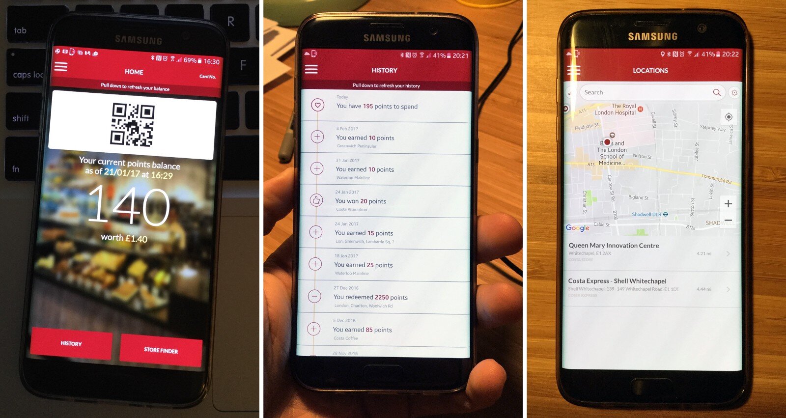
Goals
Locate a Costa Coffee shop
Pick a coffee from the menu
Order and pay for coffee
Collect Costa Coffee Club points
Check Club points balance
User Research
The questionnaire consisted of two non-intrusive screening questions — to guarantee I would be talking to the right people — followed by another eight more in depth.
Click here to read research questionnaire
Results from the user research have shown that 5 in 6 users considered having a rewards program very important. It also shows that 67% of users have Costa Coffee Club app as their main method for collecting points as opposed to 33% still using Costa Card.
In addition, 83% of users said buying coffee more frequently in the morning and have listed ‘lack of time’, ‘price’, ‘train delays’ and ‘long queues’ as main reasons preventing them from doing so more often. More importantly, 66% have rated ‘very slow’ or ‘slow’ the time required to buy coffee at Costa. When it came to payment method, the winner was card payment with 50% of answers followed by mobile payment with 33% and cash with 17%. To finish, an overwhelming 100% of users responded positively to using their mobile phones to make purchases from Costa have they had the option.
User Journey & Pain Points
Having done that, it was time to turn my attention to the user journey and whatever friction it could be imposing to customers. In order to achieve the five previously set goals, customers had to go through the following journey:

The graph above illustrates the journey every Costa customers has to face in order to achieve all five goals. It also outlines the level of satisfaction throughout and exposes its pain points.
What this graph is good at is informing where the opportunities to improve user’s experiences are and at highlighting which practices are the most effective.
Ideation
Given the fact 67% of the users I’ve spoken to already use Costa’s app, there is no doubt it should be my starting point in improving the users’ experience. At the moment, they can’t do much on the app. In fact, it only works as an alternative to the Coffee Club Card as well as checking the balance and locating stores.
It’s worth saying it does a good job in all three cases. However, I believe more could be done.
1. Locate a Costa Coffee Shop
At the moment users can either go directly to their favourite shops or quickly locate one using the app. For the latter, the process seems pretty efficient the way it is, offering search by postcode or current location.
2. Pick a Coffee from the Menu
Currently, this is a bit of a challenge. Users can only see the menu once they get to a shop. Alternatively, they can go online and check ‘Our coffees’, a landing page of Costa Coffee website focused on educating users about how the coffee prepared rather than explaining of sizes, prices and take away options.
Solution
As much as coffee lovers may appreciate learning how their coffee is prepared, offering practical information about the product may be useful. Considering the growth in popularity of mobile phones, I would make this part of the app.
3. Order & Pay
Costa surely covers all bases when it comes to payment in-store. Users can pick and choose from cash to card and contactless payment systems. However, none of these options is available either on the website or mobile app.
Solution
I acknowledged the challenges mobile ordering and payment features may impose to Costa. Not just on the app but also to the way Costa sells coffee. However, users would undoubtedly benefit from its timesaving effect and improved experience. Moreover, Costa would be addressing pain points revealed in the user journey’s research such as ‘lack of time’ and ‘long queues’, responsible for customers not buying more frequently.
4. Collect Costa Coffee Club Points
Coffee Club members can be split into two groups — app users and card users. Collecting points is a relatively simple process where both Costa Coffee and its users could benefit from opting for it.
Solution
By gradually extinguishing the physical card, Costa would cut down production costs while users would make payment and collect points in one single step when buying from the app.
5. Check Club Points Balance
Users already have easy access to their balance on the app. For those still using Costa Card, the same is offered on the website although it may be not as convenient.
Understanding User Needs and laying out the new User Journey
App Redesign
The look and feel of the app are already solid. However, to make possible what’s been said above it was necessary to do some redesigning and rearranging of content:
Coffee Club point: both QR code and balance have been moved to a top drawer which users can easily access by using the pull-down gesture on the screen.
Favourites: a swipe left takes users to their favourite items from the menu.
Store finder: a swipe to right gives access to the store finder.
Home screen: users can now place orders, check the menu, see the purchase history and send gift cards to other members straight from the app in response to what has been found in the research.
Validation
To validate my redesigns, I’ve tasked six new users with the same goals as those from before. This time they would be using my interactive prototype to help them achieve each goal.
Check out my interactive prototype here!
Users were able to complete all five tasks and friction has been reduced considerably. Of course part of the journey had to be manually operated for the test; however, with the redesigned app and a few more changes to the purchasing process, users would no longer to be put through an emotional rollercoaster.
New User Journey + Interaction Points

Conclusion
No matter how great a product might be, there’s always room for improvement, and talking to real users gave me the confidence to come up with some solutions. It’s important to highlight that I have not been commissioned by Costa or any other company to conduct this experiment. Either way, it was a great pleasure to do it and maybe contribute to a better experience for my friends coffee drinkers out there. Thanks for reading!